Monday, July 30, 2007
Week 3
This week I worked on the actual layouts. The main object is to see how all the text is going to fit in. Once I evaluate the text situation I will start to develop my grid. I did a little with the name plate and the cover and I started my first version of table of contents. I added the welcome page and the letter to the publisher. At the end of the week I saw a potential grid coming together. I'm a little late on updating this blog because of all the obligations that I had this week, but the overall vision of the magazine is starting to shape up. I'm not really trying to do anything fancy with it. I am trying to keep things clean and as open as possible. I will be taking some screen shots and posting them later.
Thursday, July 19, 2007
Week 2
7-17-07
In Class set up blog and typed up my hand written notes into the first weeks post. I also continued to work on a masthead. I explored grids for common magazines and purchased magazines to go through so that I can have a reference point when I start designing.
We also discussed forums and blogs and means of communication between the team. We decided that a forum will be the best way to communicate. We decided that being able to divide our discussions into threads would work best for our purposes.
We also split the class into groups; one working on the DC magazine and the other working on the San Francisco magazine.
DC Group: Kelly, Sam, Teryn, Tammy and me. San Fran Group: Christine, Harry, Chris, Tim and Iyvonne.
7-19-07
In ClassToday I continued to work on the process blog so that I could get the style and format out of the way and get to designing a workable grid. Today Joyce E. Lavery from Out of the Box Media is coming to answer questions and discuss the vision of the magazine. This will be the second time we met with Joyce. The first time was a general discussion about the magazine, what it is about, it's goals and the direction that it is going in. Today will be a more refined discussion about what is expected of us.
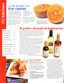 While waiting for Joyce I presented to the class a layout in Fine Cooking that I thought would benefit the class. I felt that this was relevent because it is an upscale cooking magazine that used the grid effectively as well as brought color to the type treatment that complimented the food photos. Although the layout seemed a little disorganized and cluttered, I felt that it broke the text up effectively and also gave the magazine some welcomed variety in the layout.
Joyce came in and answered questions and really helped to clarify the direction that the magazine should be going. She empahsized that Michel Richard likes very clean layouts with a lot of white space. She wasn't necessarily opposed to changing the wording fo the masthead, but wasn't enthused about it either. She basically said that she would be open to it, but there was reason behind the name D.C. Chefs as opposed to Washington D.C. Chef which I thought would fit an overall brand better especially if other cities were added to the magazine at a later date.
7-21-07
At Home I went through the DC Chefs magazine and did a formal critique. It took me a while to actually type it up, but you can read it here if you like. Now that I got all of the formalities out of the way and have done plenty of research, I can actually start designing this thing. You can never get ahead of yourself on a project like this, especially while working full time and have two other classes to contend with. I have a feeling this is probably going to be a demanding quarter and a demanding class. I'm excited to start my sketches and start working on the grid and style sheets.
7-23-07
At Home I did some sketches of grids and general layouts.
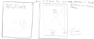
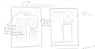
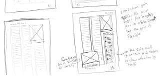
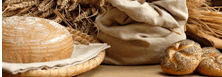
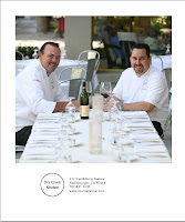
It is kind of wierd sketching out grids, seeing that it is easier to see how things are going to look on the computer, but it helps me think a bit. I created an initial layout to see how the style was going to work out. I used the Dry Creek Kitchen information and pictures to do the layout—even though they are from the San Fran magazine—because I had access to the pictures and copy.

In Class set up blog and typed up my hand written notes into the first weeks post. I also continued to work on a masthead. I explored grids for common magazines and purchased magazines to go through so that I can have a reference point when I start designing.
We also discussed forums and blogs and means of communication between the team. We decided that a forum will be the best way to communicate. We decided that being able to divide our discussions into threads would work best for our purposes.
We also split the class into groups; one working on the DC magazine and the other working on the San Francisco magazine.
DC Group: Kelly, Sam, Teryn, Tammy and me. San Fran Group: Christine, Harry, Chris, Tim and Iyvonne.
7-19-07
In ClassToday I continued to work on the process blog so that I could get the style and format out of the way and get to designing a workable grid. Today Joyce E. Lavery from Out of the Box Media is coming to answer questions and discuss the vision of the magazine. This will be the second time we met with Joyce. The first time was a general discussion about the magazine, what it is about, it's goals and the direction that it is going in. Today will be a more refined discussion about what is expected of us.
 While waiting for Joyce I presented to the class a layout in Fine Cooking that I thought would benefit the class. I felt that this was relevent because it is an upscale cooking magazine that used the grid effectively as well as brought color to the type treatment that complimented the food photos. Although the layout seemed a little disorganized and cluttered, I felt that it broke the text up effectively and also gave the magazine some welcomed variety in the layout.
Joyce came in and answered questions and really helped to clarify the direction that the magazine should be going. She empahsized that Michel Richard likes very clean layouts with a lot of white space. She wasn't necessarily opposed to changing the wording fo the masthead, but wasn't enthused about it either. She basically said that she would be open to it, but there was reason behind the name D.C. Chefs as opposed to Washington D.C. Chef which I thought would fit an overall brand better especially if other cities were added to the magazine at a later date.
7-21-07
At Home I went through the DC Chefs magazine and did a formal critique. It took me a while to actually type it up, but you can read it here if you like. Now that I got all of the formalities out of the way and have done plenty of research, I can actually start designing this thing. You can never get ahead of yourself on a project like this, especially while working full time and have two other classes to contend with. I have a feeling this is probably going to be a demanding quarter and a demanding class. I'm excited to start my sketches and start working on the grid and style sheets.
7-23-07
At Home I did some sketches of grids and general layouts.


It is kind of wierd sketching out grids, seeing that it is easier to see how things are going to look on the computer, but it helps me think a bit. I created an initial layout to see how the style was going to work out. I used the Dry Creek Kitchen information and pictures to do the layout—even though they are from the San Fran magazine—because I had access to the pictures and copy.


Tuesday, July 17, 2007
Week 1
7-10-07
Looked through both magazines—DC and San Fran—and took a critical look at all of the errors that where made during the production side of the project. I then started to evaluate the design as a whole.
After going through a general discovery of the magazines I started to make a list of the things that I didn't like about how the magazine was designed. This list could have been extensive because of all of the things that I found that I didn't like, but I kept it to a minimum and tried to find things that I did like.
-Likes:
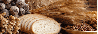
I liked the photographs
I kind of liked the size of the magazine
I thought that the cover stock was nice
--
I also went to the www.mycreativecow.com and did some research on the company that had produced the magazine initially.
7-12-07
went to the library and researched "food magazines" to get the feel of their particular styles. As I looked through the magazines I jotted down notes about the things that I liked and some things that seemed to represent the industry. I tried to find things that seemed common among the magazines.
Looked through both magazines—DC and San Fran—and took a critical look at all of the errors that where made during the production side of the project. I then started to evaluate the design as a whole.
After going through a general discovery of the magazines I started to make a list of the things that I didn't like about how the magazine was designed. This list could have been extensive because of all of the things that I found that I didn't like, but I kept it to a minimum and tried to find things that I did like.
-Likes:
I liked the photographs
I kind of liked the size of the magazine
I thought that the cover stock was nice
--
I also went to the www.mycreativecow.com and did some research on the company that had produced the magazine initially.
7-12-07
went to the library and researched "food magazines" to get the feel of their particular styles. As I looked through the magazines I jotted down notes about the things that I liked and some things that seemed to represent the industry. I tried to find things that seemed common among the magazines.
- Santé
- used a modern serif font with a thin sans serif geometric font throughout magazine
body copy is a modern serif font - Masthead: bold sans serif font
- two column layout *not very innovative but gets the job done okay in this magazine
- Cater Source
- fonts used are: transitional serif for main copy and a geometric sans serif for headings
- three columns used for layout. *this seems to work really well and gives the magazine a lot of variety.
- Masthead: bold sans serif font
- Gourmet
- fonts used are: transitional serif for main copy and grotesque sans serif (probably Helvetica) for heads and subheads.
- mostly two column spreads but it does break down into three columns at times. This is nice way to break things up.
- margins are about 1/2'' from the edge of the page which is too close
- Food & Wine
- 3 column spreads work well, but there are areas where it is 4 columns and this is too hard to read. There is one interesting spread where the body copy is 1 column and the recipe is 3 columns on the same page, where the one column is placed on the upper left so that the third column (of the three columns) runs adjacent to the 1 column and the length of the page.
Subscribe to:
Posts (Atom)